The Geographic Origins of Iconic Car Logos — Part 1
Explore how BMW, Porsche, Ferrari, Lamborghini and Skoda built their emblems on local symbols—from Bavaria’s flag to Stuttgart’s horse and Modena’s yellow legacy.
Every car logo is more than just a badge — it’s a kind of passport of origin. Behind these clean shapes lie flags, coats of arms, and personal stories that speak about each brand’s roots more eloquently than any archive.
BMW is perhaps the clearest example. For decades, many believed its blue-and-white circle represented a spinning propeller — a nod to the brand’s aviation past. Yet BMW itself has long dispelled that myth. According to the company’s official explanation, the colors come from the Bavarian flag, where the brand was born. The reversed order of the blue and white sections follows old heraldic law, which forbade the direct reproduction of state symbols in commercial trademarks.
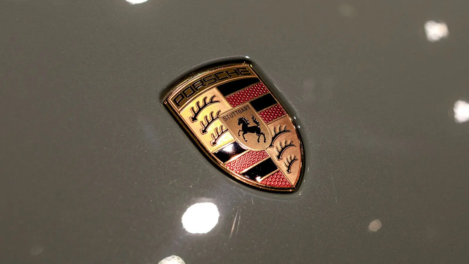
For Porsche, the symbolism is literal. Its shield unites two coats of arms — that of Stuttgart and of Württemberg. The horse represents Stuttgart, historically “the place of stud farms,” while the antlers and red-black stripes come from the Württemberg crest. Designed by Franz Xaver Reimspieß, the emblem first appeared on the Porsche 356 in the early 1950s. In 2023, Porsche refreshed the logo’s look while preserving its essence.
Ferrari tells another story — almost a legend. In 1923, Enzo Ferrari met the parents of World War I ace Francesco Baracca. Baracca’s plane bore the image of a black horse, and his mother suggested Enzo adopt it for good luck. That black prancing horse on a yellow background — the color of Modena — became a timeless symbol of Italian spirit and racing passion.
Lamborghini’s emblem is more personal. Ferruccio Lamborghini, born under the Taurus sign, chose the bull not for marketing reasons but out of conviction: strength, determination, and boldness were traits he wanted in his cars. When Lamborghini updated its visual identity in 2024, the bull remained firmly at its heart.
Skoda tells an industrial story. Its “winged arrow,” registered in 1923, still stands for speed and progress. The designer remains unknown, though company records suggest it was the result of an internal design competition. The three-feathered arrow became a proud emblem of Czech engineering — precise yet poetic.
Together, these five emblems reveal how geography is embedded in automotive DNA. Coats of arms, flags, and shapes do more than decorate a bonnet — they anchor cars to the places where they were born. In an era of digital rebranding, such logos remind us that every marque began somewhere real, with people and ideas that gave it character.
Allen Garwin
2025, Oct 24 16:39